Website for ARNETTE, Luxottica
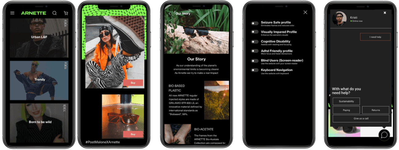
Project Details: Worked with focus on the eye-wear brand ARNETTE in Luxottica to design a website with e-commerce for the Gen Z.
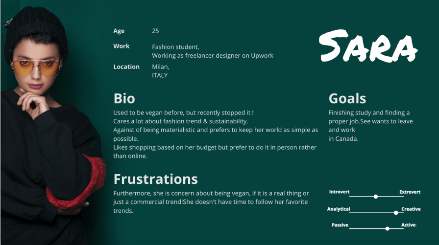
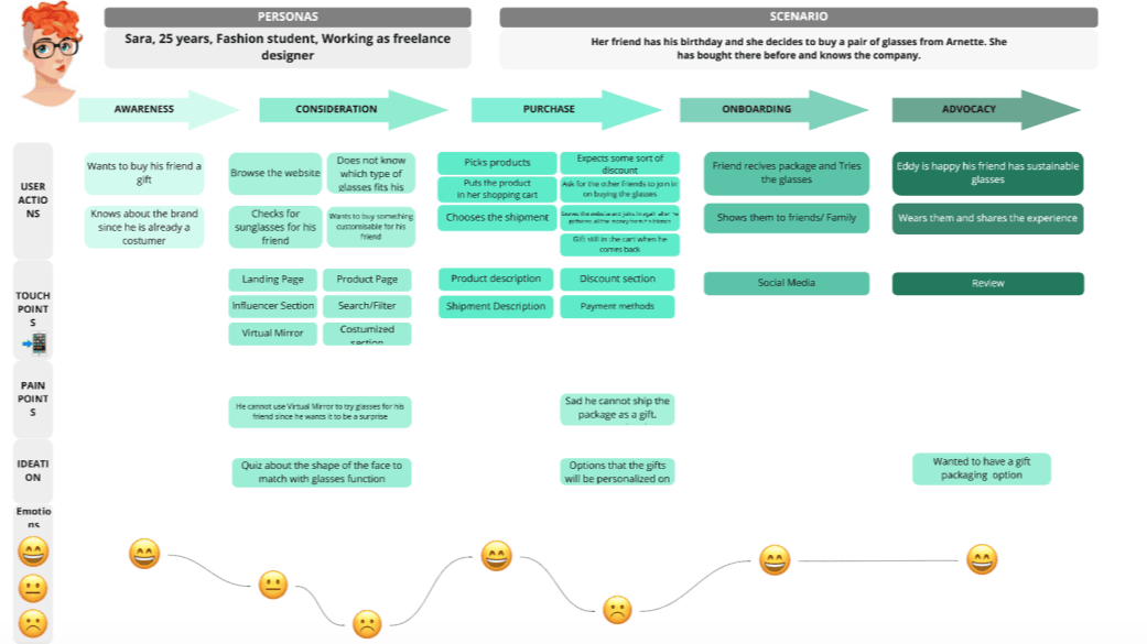
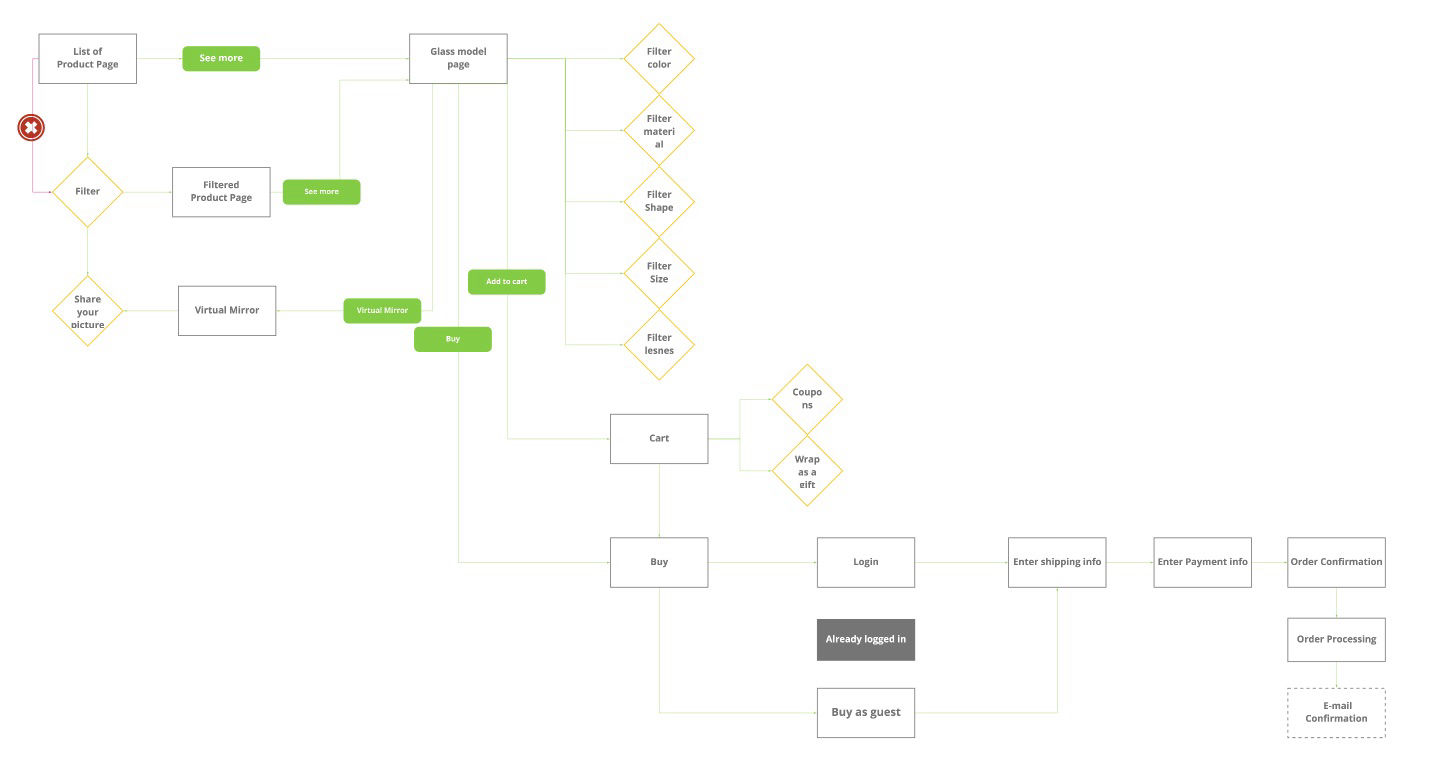
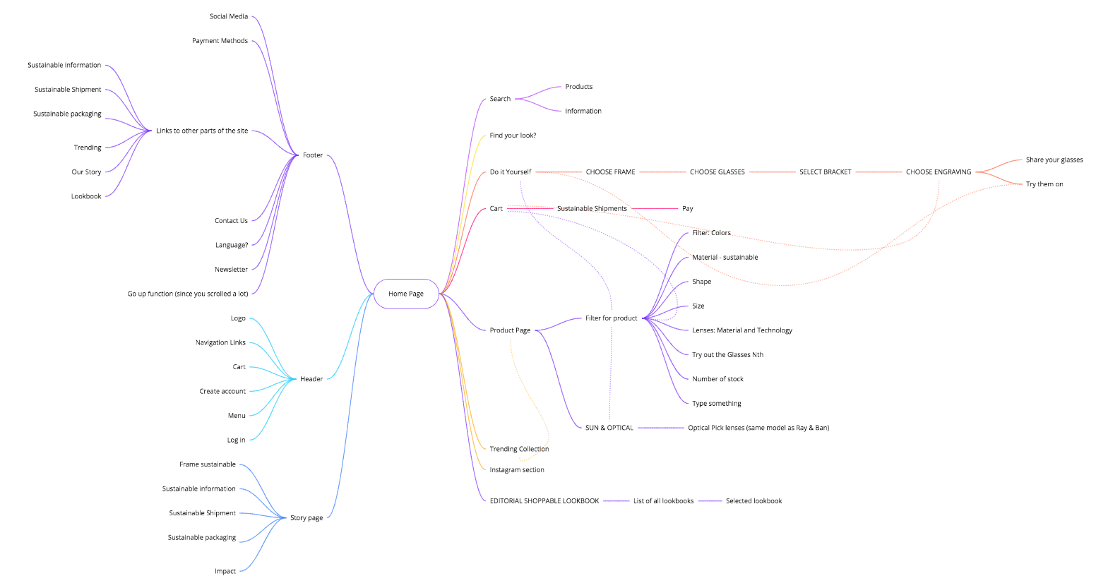
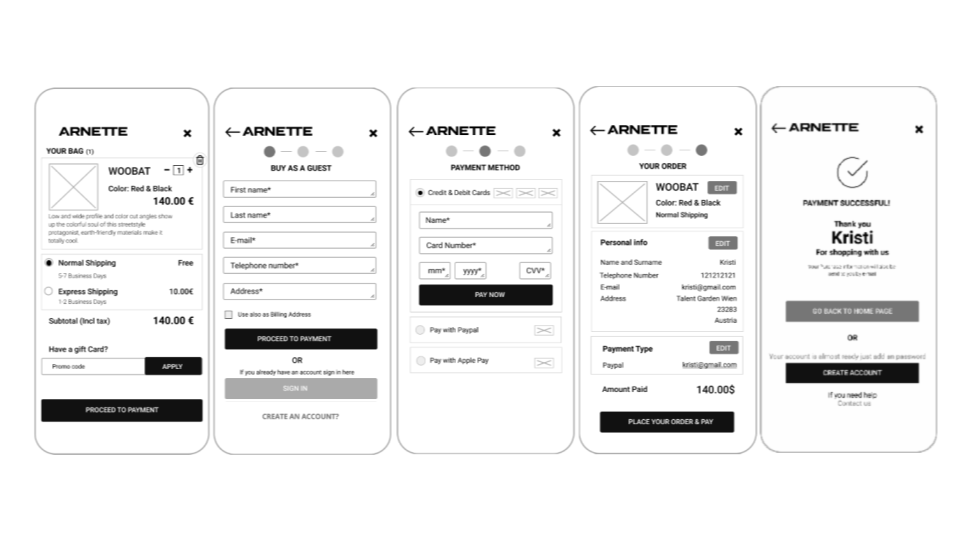
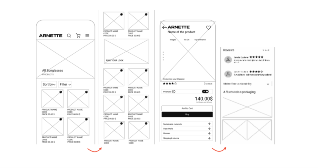
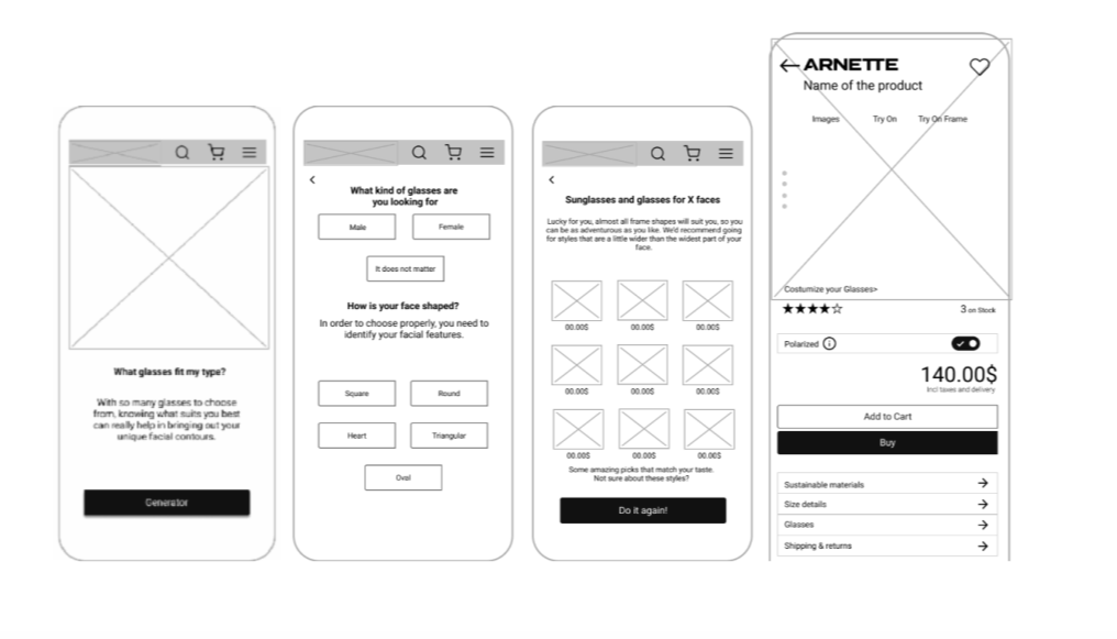
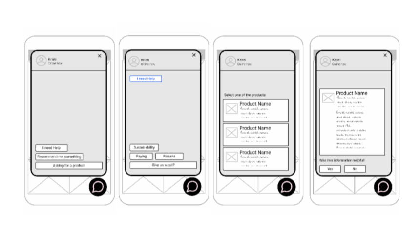
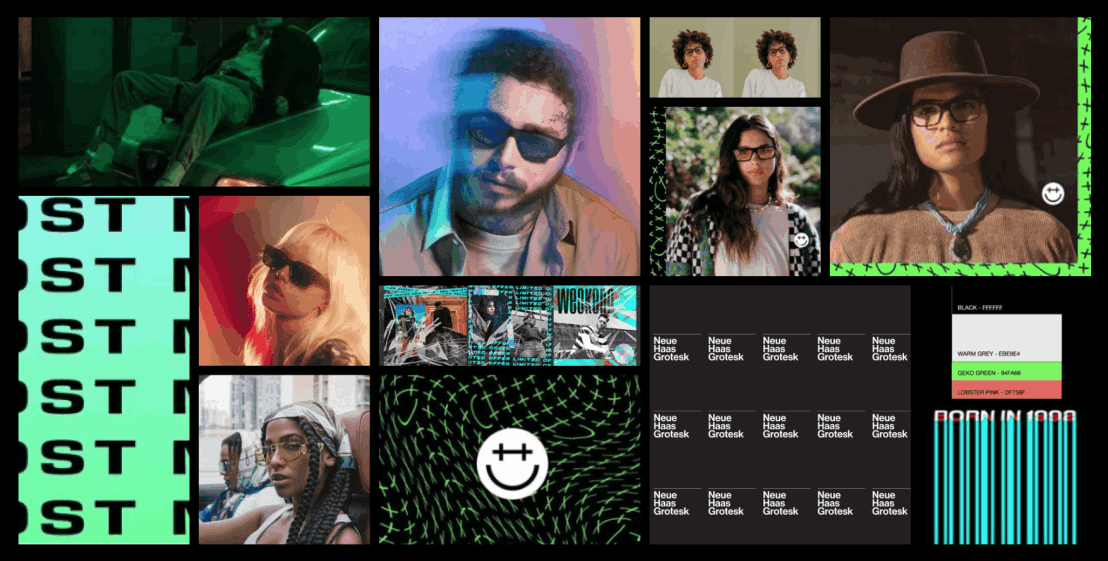
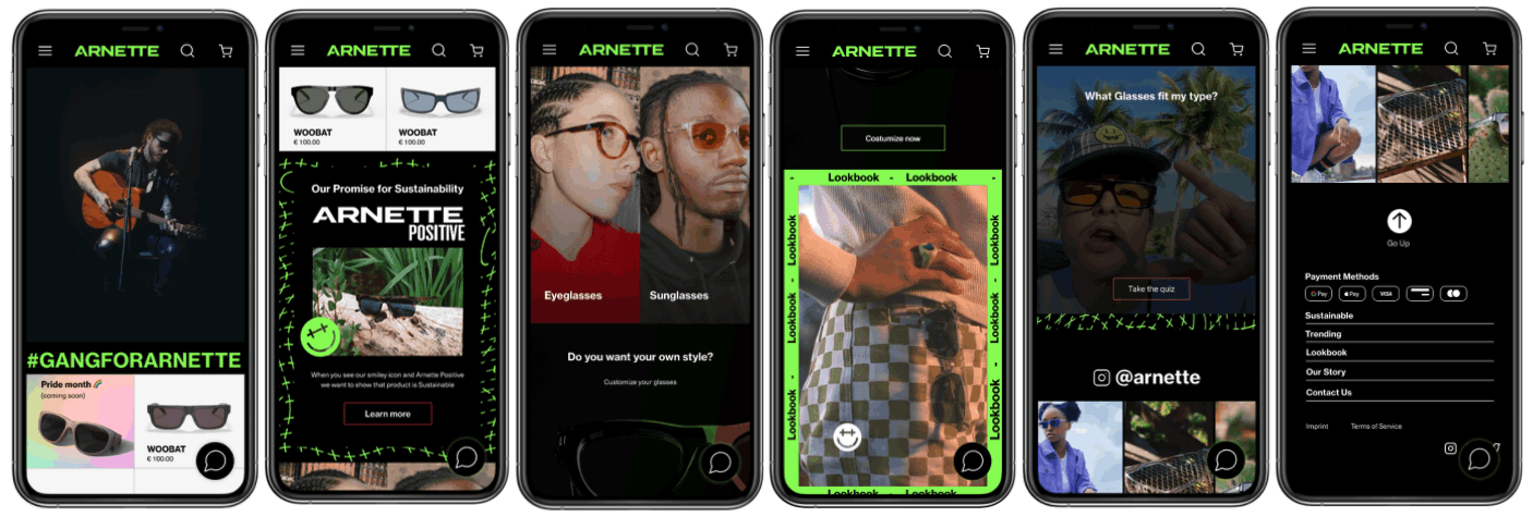
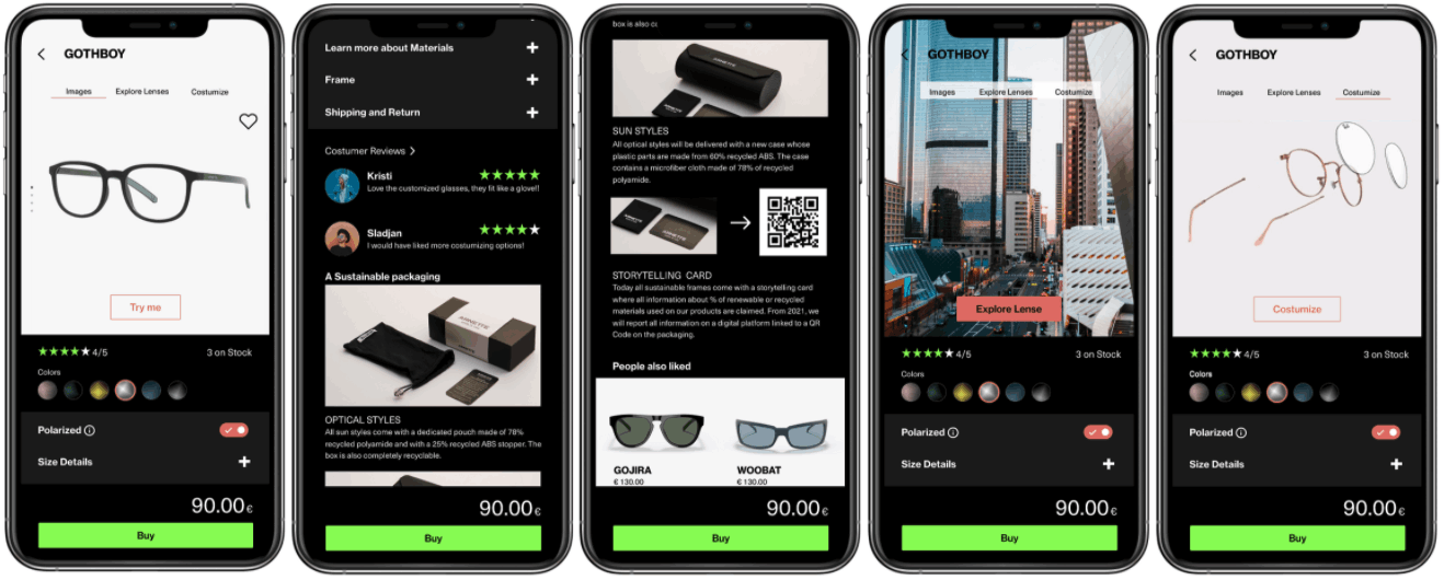
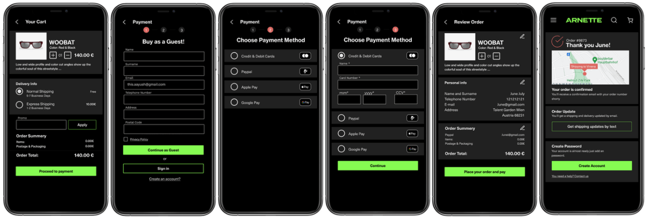
UX Research: Conducted Desk research and User interviews, generated User personas, Journey maps, Value propositions and User flows, and Analysis.UX/UI Design: Generated Concept sketching, Lo-fi wire frame, and conducted a Feedback session on Lo-fi wire frame. Generated a Moodboard for UI, Hi-fi Mockup and Usability testing & interviews on Hi-fi Mockup.
My Role in the team: I am an UX/UI Designer with 3 another UX/UI Designers
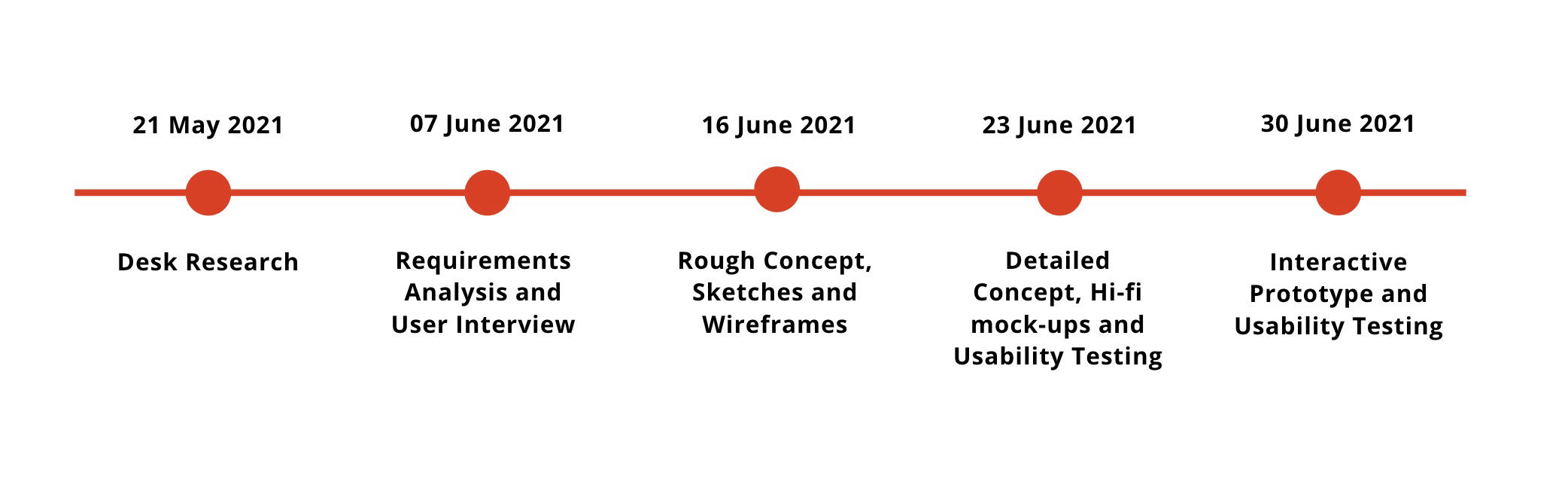
Timeline:May 2021 - June 2021 (one and a half month)